THP为美好+1|用设计助力公益
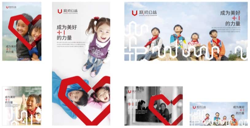
The new brand VI of Shanghai United Foundation and “E.G.G. WALKATHON” will be unveiled in the offline event on May 13th. And THP, as a long-term support partner for four years, has also put efforts into this upgrade project, and carried out a comprehensive brand renewal action together with Shanghai United Foundation.
联劝公益及“一个鸡蛋的暴走”的全新品牌视觉形象升级,即将在5月13日的线下活动中闪亮登场。而THP作为联劝公益4年以来的长期支持伙伴,也为此次升级计划注入了心血,携手联劝一起全面开展了品牌焕新行动。
Tackling Pain Points & Defining the Core
Emphasize the core value of the brand through visual expression.
[发现痛点|定义核心] 用视觉表达强调品牌核心价值
After communication, we found that the original visual image of “E.G.G. WALKATHON” was relatively traditional. Its graphic composition was purely derived from the interpretation of the text name and has no strong connection with the core connotation of the brand.
Therefore, starting from the role of Shanghai United Foundation, we focused on the brand concept of “More Than Kindness” and integrated it into the constituent genes of sub-brands in a graphic extension way, thereby expressing the brand’s appeal to social public welfare forces.
经过前期的沟通,我们发现,“一个鸡蛋的暴走”原本的视觉形象比较传统,其图形构成单纯来自于对文字名称的解读,与品牌的核心内涵的关联度不大。
因此,我们从联劝公益最初的愿景出发,围绕品牌核心“成为美好+1的力量”,以图形延展的方式,与子品牌构成基因相互融合,由此传达品牌对于社会公益力量的呼吁和号召。
Examining Details & Unifying Visuals
Use the optimization of details to unify the order of brand vision.
[审视细节|视觉统一] 用细节优化统一品牌视觉秩序
In fact, we have not only upgraded the visual system of “E.G.G. WALKATHON”, we have also made detailed adjustments to the logo of the main brand – Shanghai United Foundation. We balanced the visual weight of its U-shaped icon, adjusted the proportion of Chinese and English characters, and redefined the layout of the logo and slogan.

事实上,我们不止升级了“一个鸡蛋的暴走”的视觉系统,还为主品牌“联劝公益”的Logo做了细枝末节的调整。对于联劝的U型主视觉,我们重量后进行了平衡,并调整了中英文文字比例,以及对Logo与Slogan的排布方式也进行了重新规范。
同时,通过对Logo中U字的重组、排列,设计出了不同的纹样图形,并赋予其不同的含义,以此作为不同使用场景的辅助图形应用。
At the same time, by reorganizing and arranging the U-shaped icons in the Logo, we designed different patterns and graphics, and gave them different meanings, so as to serve as auxiliary graphics applications in different scenarios.
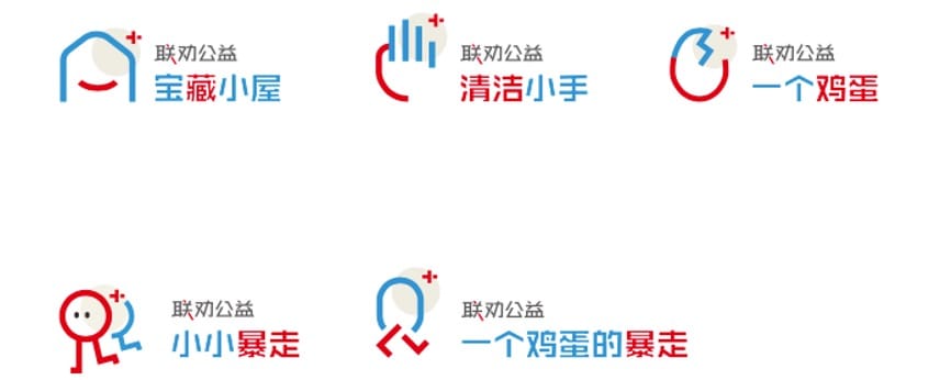
In addition to the upgrading and renewal of the main brand Logo, we also developed a new sub-brand visual system. The main and sub-brands complement each other to achieve the unity of visual order, and develop a more complete use of brand logo specifications and standards, so as to facilitate the subsequent adaptation to various application scenarios.
当然除了围绕主品牌 Logo 的升级焕新,我们也发展了全新子品牌视觉体系,主与子之间相辅相成,达成视觉秩序的统一,并且制定更完整的品牌标识使用规范和标准,方便后续适应于各类运用场景。
Emotional Resonance & More Than Design
More than Kindness.
[情感共鸣|不止设计] 成为美好+1的力量
During the entire design process, we experienced a 3-month lockdown due to the epidemic. We longed for a return to normalcy, but were powerless to be trapped. But it is also this special experience in the design process that allows us to see more spiritual power brought by the goodwill between people. At the same time, our chief designer Yue Liualso became a mother during this period.
The joy of new birth unlocks a new force for the team, allowing us to find infinite beauty and hope, and add inspiration for creative ideas.
在项目发生期间,团队也经历了长达3个月的灰色时期—疫情的卷土重来为一切都按下了暂停键,。我们渴望恢复常态,却又无力受困。但也正是在设计的过程中这段特别的经历,让我们看到了更多人与人之间的美好善意带来的精神力量。同时,团队的主创设计师刘越在此期间也成为了一名母亲,新生的喜悦为团队解锁了一股新力量,让我们更能发现无限美好与希望,为创意添加灵感。
More than kindness, THP uses professional design to empower charity
THP用专业的设计为公益助力,成为美好+1的力量。
